Tuesday, December 6, 2016

Artifact


This video artifact promotes the Scout and Cloth campaign by employing effective motion picture techniques and design principles.

In concept, the promo aims to surprise an audience expecting to see a typical montage of women’s clothing by abruptly cutting the music and deliberately bringing attention to the initial inappropriateness of a male model in such a video. In this subversion of expectation, attention is better captured.

A white background acts as a clear “ground” to the figures of the models. Negative space around individuals brings attention to them and helps the texture of their clothing pop. This is consistent with the black, white, and grays chosen for our style guide as these were selected to let the clothing speak for itself, and the same effect is present here. Additionally, the style guide is employed in using the Gill Sans Light font and company logo. This further establishes a sense of similarity throughout the campaign (law of similarity)

Slow motion techniques are used to accent certain moments in the video that may go less noticed at a faster speed.

Monday, November 21, 2016

Final Project Day One

After some deliberation, our group has decided to propose a campaign for the fashion line Scout and Cloth advertising a new line of men’s products and rebranding the company. Currently the company is somewhat aimless, practically living on the quality of their products rather than a strong brand and use of good design (in advertising). Their website needs serious work. Below I’ve identified several issues.
  • Garbage, indistinguishable favicon
  • Mixing of traditional and all caps tabs
  • Many fonts
  • Lack of male appeal
  • Arrow faces right to left (left to right more natural)
  • Too man quotes/slogans
  • About tab is horribly formatted and consists of a meaningless block of text about the designer rather than the product
  • Blog tab opens a window with only one option
  • Shop tab opens a dropdown menu with 11 tabs including SALE!!!!! and WEEKLY DEALS which could easily be combined under one tab
  • Street style line only consists of one product
  • MOVEMENT and WEEKLY DEALS tabs take one to a blank page
  • DRESSES, SKIRTS-BOTTOMS tab does not include dresses


My artifact contribution to the group will a brief commercial displaying a new line of products for men. This video should be more serious than the video intended for social media.

Target persona

Landon is 31, a creative type who works from home. He lives a simple life, but cares about how he looks and has a buck or two to dedicate to such a pursuit. Landon has been in a serious relationship with his girlfriend for several years and makes a point to clean and groom himself more than those without a woman tend to. In his spare time, he enjoys travelling, disc golf, and playing the ukulele.

Wednesday, November 9, 2016

Mis-en-Scene (Individual)

Film - The Matrix (1999)
Scene - Rooftop Bullet Time
Directors - The Wachowski Siblings


While it takes an army to make a film, I believe the director (or in this case directors) has the most influence on what is crafted. Others look to them to have an artistic vision and balance critical elements of a project. Without a director, a movie becomes aimless.

“The Matrix” was an achievement both in is groundbreaking special effects and its effectiveness as a story. These elements heighten one another, and for this the movie can also be called an achievement in directing.

The iconic rooftop bullet time scene is especially well done both in its composition and general execution. Having also written the film, the Wachowskis provided a creative starting point, and were heavily involved in the preparation required to pull off the sequence. Even before cameras rolled they were making shot-lists and envisioning something that had never been done before. The choice to end the scene with Trinity killing an agent was made on paper long before it was decided to throw the shot into slow motion.

More than any other position listed here, a director is involved in the post production process, suggesting what takes should be used and how the final sequence should play out. While making the film, they are also the ones to interact most with actors, encouraging a certain type of performance and dictating some blocking/motion.

This scene from “The Matrix” is a brilliant piece of cinema that exhibits many design principles from washed out building that fade into the background (figure vs ground/pragnanz) to Neo’s bullet scuffs standing out due to their texture (although the buildings also offer some interesting lines and framing options). Within the context of the film there is contrast in color tones between the greenish tint of this scene to the blueish tone of everything outside the matrix. Shots are well balanced when appropriate. The camera moves in ways that accentuate the action. All of this comes together to create one hell of a sequence that would have been impossible without the directors’ contributions.

Tuesday, November 8, 2016

Mis-en-Scene (Group)

Film - The Matrix (1999)
Scene - Rooftop Bullet Time


Director(s) - The Wachowski Siblings

  • Artistic vision
  • Post production
  • Actor direction

DP - Bill Pope

  • Bullet time shot
  • Color tint
  • Framing
  • Lighting
  • Camera movement

Production Designer - Owen Paterson

  • Locations
  • Helicopter
  • Use of green screen/CGI
  • Storyboards

Art Director - Hugh Bateup & Michelle McGahey

  • Costumes
  • Weapons
  • Green screen sets

Wednesday, October 19, 2016

Compose Your Frame


This is an image of 100 South Street just north of Dixie State University. Despite it being a simple photo, it incorporates the diagonal rule, a motion vector, and the rule of thirds.

 The road itself shapes a distinct diagonal that moves toward the right side of the frame as it draws near. Because of this, the eye is led through the frame as if watching a car approach from the left and travel off to the right. The south side of the road is closer to being level, but also contributes to this effect. These elements, in combination with other markings on the road, make for a greater sense of motion within the frame than if the lines were perfectly straight up or down.

All the cars act as motion vectors, but the nearest is the most effective, swaying the net force to the right rather than the left. This is to be expected as the closer the proximity of an object to the frame the more amplified the psychological context gets. We understand that cars move, especially on roads. This context makes it clear that the vehicles are not merely parked. It can reasonable be assumed that the white car would continue moving forward were we to see another “frame” into the sequence, and this further contributes to a feeling of action within a still image. I also believe the traffic markers pop more on account of their diagonal stripes.


Last, the photo acknowledges the rule of thirds, placing the white car (an object of focus) at a point of intersection. Furthermore, the top third line lies very near the horizon making for an all-around stronger composition.

Monday, September 19, 2016

Design Evaluation


Kellogg’s Special K line of cereals come in packages ranging in quality from mediocre to acceptable. While it’s difficult to outline what exactly is lacking, their designs indisputable could be improved. For now, we’ll focus on the shortcomings of the “fruit and yogurt” edition.

Why the packaging of these cereals are so feminine escapes me. Maybe they cut a deal with the bacon and eggs advertising department, but this product has appeal to both sexes at its heart, and still it incorporates soft, low-intensity colors and non-threatening curves (notice the giant K). Over the likes of Cinnamon Toast Crunch (diabetes in a box), Special K has potential with the health conscious crowd, but to this end it’s a bit overdone. It looks like something your doctor might prescribe. The design is needlessly cluttered with graphics and information. Furthermore, the package could benefit from a consistent color theme rather than blue, white, red, purple, a bit of black, and some shades of tan.

However, the current Special K design’s failings are most obvious when held against a proposed design from student Mun Joo Jane. This project offers a unique, cylindrical package with a bolder and more focused theme. Altogether it makes for a much more appealing product.


While the boxed package comes off cluttered, distinctly feminine, and slightly childish, Jane’s creation is refreshingly simple yet innovative, universally appealing, and mature. The “tube” boasts consistent reds and blacks on a simple white background that allows our focus to travel to where it really matters. The Gestalt law of pragnanz suggests a human preference for simplicity, and this product takes advantage of this to a much greater degree than the box. Opposite the current design, the tube is gender neutral, and strong, with a bold K+ replacing a dated, glossy K. This product refuses to buy into the way cereal is typically marketed toward children with bright colors and a collage of graphics (a smart move given how kids would probably react to the taste of the stuff). It isn’t specifically a man’s breakfast or a woman’s breakfast, but it’s got a sense of order that makes it an adult’s breakfast. Even though the Kellogg’s logo is smaller on Jane’s design, it still preserves brand identity better given that it’s one of very few graphics, and a red one at that, contrasting a clean, white base.

Although Kellogg’s design exhibits texture by presenting an enlarged image of rough, gritty flakes, the alternative accomplishes the same thing with a transparent window that lets the product speak for itself, and there’s a charismatic sense of honesty and genuineness to that. Plus, the cereal contrasts better against a white background than a cluttered, purple mess.

All in all, this student-designed product would have my eyes and wallet well before the current, so-so packaging due to its elegance, simplicity, and incorporation of design principles.


Monday, September 12, 2016

Gestalt Activity


Tay 650-15 Fan

Closure - Objects grouped together are seen as a whole

  • Fan is seen as a fan rather than a collection of blades
  • Space between blades is overlooked

Continuity - Lines are seen as following the smoothest path

  • Sculpture moves your eye around the propeller
  • Blades are placed circularly so your eye goes around looking at each blade
  • Light creates contrast by reflecting off the right side

Similarity - Items that are similar tend to be grouped together

Monday, September 5, 2016

Contrast, Harmony and Balance


Here we have a black and white image of an individual standing on a railroad river crossing. It’s fair to assume most would consider this a photograph of value because it’s cool or “real neat”, but there are distinct qualities captured here that make it an objectively effective image.

First, a lack of color provides obvious contrast. The literal shadows are defined against a highlighted floor, and the dark beams that make up the bridge’s structure (figures) pop against an illuminated body of water (ground). The contrast in size between the miniscule figure and the colossal bridge structure gives the image weight in that the size of a person is fairly consistent, so we can use it as a gage for the scope of the photo. In this case the person is also a figure to the ground of the bridge and begs our focus.

Second, the image is balanced through symmetry. The photographer took advantage of the bridge’s symmetrical design with an image straight down the middle. In this way neither side is off balanced by the other, and the picture has an organized, structured look to it.

This symmetry contributes to the image’s final quality to be discussed: harmony. Symmetrical balance creates a sense of tranquility and elegance that contributes to an overall feeling of harmony. However, the photo isn’t acutely mirrored down the center. It has a sense of natural symmetry to it instead of an artificial pattern, and this is easier on the eyes. The image feels at peace, like sitting on a back porch and watching the sun set after a long day’s work. There’s no active motion to be found. The water is still and everything seems to fit in its rightful place. Although a railroad crossing is probably not the safest place to stand around, the individual appears to be in no hurry. Their peace is contagious. Cross patterns are repeated throughout and give the image a consistent feel. Although it’s borderline too dark to make out the bridge’s upper portion, the Gestalt law of similarity connects the cross at the top with those lower down in the bridge structure. Repeated elements of the bridge make it feel like a single object even though much of it is out of frame. Furthermore, the law of continuity lets the railroad tracks lead our eyes into the image despite other lines intersecting.


Altogether, these factors contribute to a brilliant image.

Saturday, August 27, 2016

Visceral Response


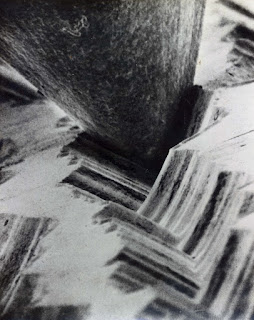
Richard Seymour describes beauty as a subjective experience, something one feels inside that’s difficult to describe. For me the first thing to come to mind based on his definition of stupefying beauty is this image of a needle being dragged across a record magnified some 1000 or so times. This is something that creates a rare true sense of wonder in me not just in context but as an image.

Some of the things discussed in class help explain this. For one, the image is filled with texture. This is especially present in the jagged record grooves that look like they might give you splinters. The way shadows accentuate these features, particularly in a photo as desaturated as this one, makes the grooves almost pop into reality. One could even expect to feel them as they run their hands down a print of this image. The textured grooves themselves function as lines that draw one into the photo’s heart. Likewise, the needle appears somewhat organic; like a giant shark tooth plunged into slopes of music. The framing of the picture helps suggest the needle’s size, and the amount of space occupied makes it feel much larger than it is in reality.

Altogether these elements unnaturally present a subtle process as some sort of climactic event of consequence. To magnify something like this provides a unique perspective with potential to amaze.

However, Seymour also emphasized how context can be a great source of beauty, and that’s the real kicker here. To Seymour a plastic bag was beautiful only after he realized its ability to cleanse, and a particular water bottle design impressed him simply because he recognized how difficult it must have been to craft. First, this photo is impressive in the technology it must have taken to capture it, but more so I find this image stupefying because I know that somehow this process can relay David Bowie’s “Life on Mars”. I can look at this picture and say, “so that’s music…”, and that impresses me deeply. I spend a few bucks or so most every month on the “outdated” vinyl format, and this exact image is a contributor to that on account of how incredible I find it. Considering Seymour’s final comments on beauty being a motivator, specifically a motivator to purchase things, it’s safe to say this image is beautiful and meaningful, to me.